Mistakes happen. Web pages get lost, and links get mangled. But if your website serves up a standard “404 Not Found” page when something goes wrong, you’re missing a valuable chance to turn a negative into a positive.
Designing a 404 page might not seem like an important opportunity, but handling errors elegantly is vital for creating a positive experience for your visitors. Here’s how to do it.
Stay On-Brand
Landing on an error page is already a jolt for your visitors, so don’t make things worse by presenting an unfamiliar experience.
Your 404 error page should stay true to your branding in both design and language. Although you’d ideally want no one to see this page, that’s no reason to skimp on making it as seamless as possible. Consistency in colors, fonts, logos, and even tone of voice ensures that visitors still feel like they are on your website rather than being abruptly thrown into the unknown.
A well-branded 404 page keeps visitors engaged and helps them find their way back to useful content. Here are some great examples of websites that handle 404 errors with style and purpose:
KonMari
KonMari takes decluttering to its 404 page with a message that reads, “We’ve been tidying up—and we let go of this page with gratitude.” It’s clean, minimalist, and perfectly in line with their brand. A simple link back to the homepage helps visitors get back on track.

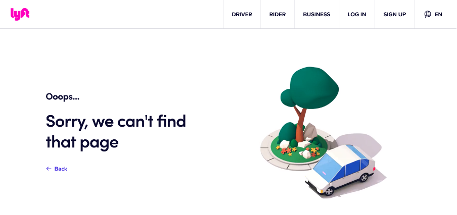
Lyft
Lyft uses an animation of a car driving in circles around a tree—on-brand for a ridesharing company and a fun way to illustrate that you’re lost. The page remains practical with a clear menu at the top for drivers and riders, plus a quick link to return to the previous page.
Webflow
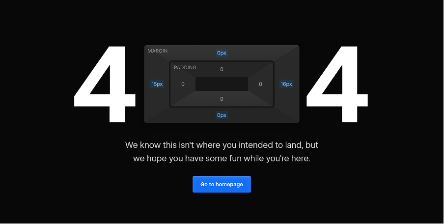
Webflow makes their 404 page interactive by turning the “0” in “404” into a draggable UI element from their margin/padding editor. It’s a clever nod to their design tools. Below, a friendly message says, “We know this isn’t where you intended to land, but we hope you have some fun while you’re here.”
Make It Friendly
No one likes an error, but your visitors really won’t appreciate being made to feel responsible for it. Avoid confusing tech jargon and make it clear that the issue is on your end. Apologize and assure visitors that your web team is addressing the problem.
A simple, warm message like “Oops! We can’t find that page, but don’t worry—we’ll help you get back on track!” is much better than a cold, robotic “Error 404: Page Not Found.”
Headspace
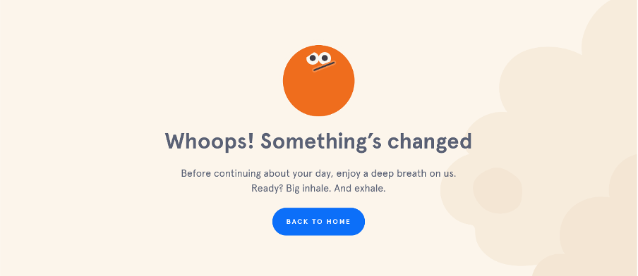
Headspace provides an excellent example of a 404 page with a friendly tone. Their page displays, “Whoops! Something’s changed,” followed by, “Before continuing about your day, enjoy a deep breath on us. Ready? Big inhale. And exhale.” This aligns perfectly with their brand’s focus on mindfulness and creates a soothing experience for visitors.
Use Humor, But Be Careful
Humor can be a great way to diffuse a potentially frustrating situation. However, it’s a fine line to walk, as not everyone shares the same sense of humor. If you’re going to inject humor into your 404 page, make sure it’s in keeping with your brand, audience, and tone of voice.
The World Association of Zoos and Aquariums (WAZA)
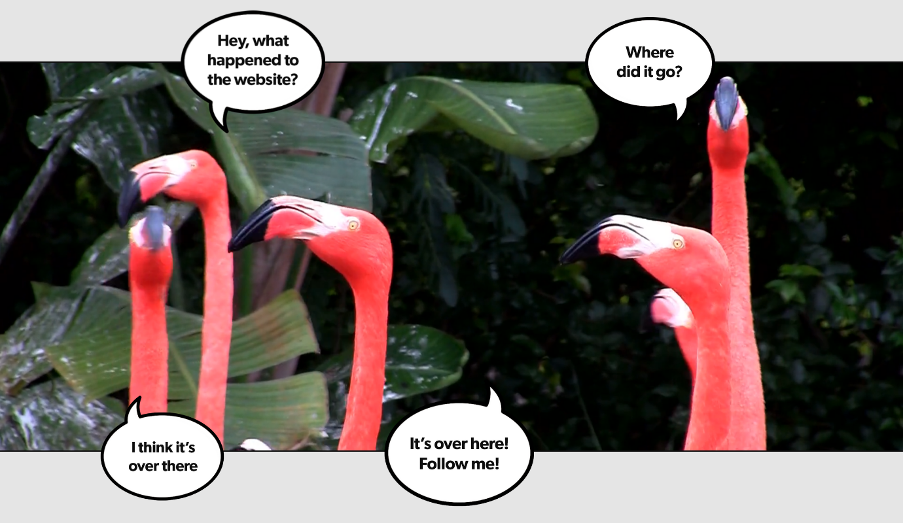
The World Association of Zoos and Aquariums (WAZA) showcases humor effectively on their 404 page. Their page features a hilarious video of flamingos that are clearly lost—a perfect metaphor for a missing page that keeps visitors entertained.
LEGO
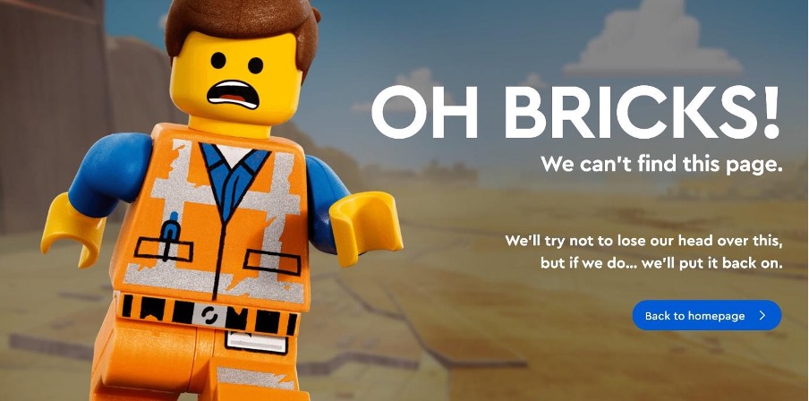
LEGO takes a playful approach by showing a LEGO figure in distress with the message, “OH BRICKS!” It’s fun, brand-consistent, and keeps frustration levels low.
NASA

NASA keeps things space-themed with a clever message: “The cosmic object you were looking for has disappeared beyond the event horizon.”
Provide a Reason
A 404 means a missing page, but there can be multiple underlying causes. Don’t leave visitors wondering—provide some context.
Use back-end tech to detect the issue. If your visitor is logged in, has a session ID, or an internal referrer, you may have control over the problem. Simply admit that something went wrong and that you’re working to fix it.
If it looks like the visitor arrived directly, suggest they check their address bar for typos. They may have made a cut-and-paste error, or perhaps their bookmarks need updating. Either way, a helpful, non-accusatory explanation can work wonders.
Niagara Region
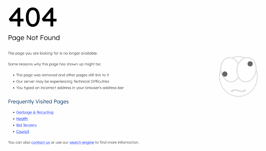
An example of this approach is the Niagara Region 404 page, which clearly lists possible reasons why the error occurred.
Back-End Reporting
If possible, have your system generate a behind-the-scenes report for your developers whenever a 404 error occurs. While this won’t immediately help the visitor, firing off an automated email to your webmaster with relevant background information can help minimize future occurrences.
Don’t Leave Visitors Dangling
Don’t let an error page be the end of a visitor’s journey. At the very least, provide prominent links to your site’s homepage or popular sections to give users somewhere to go next.
Uber
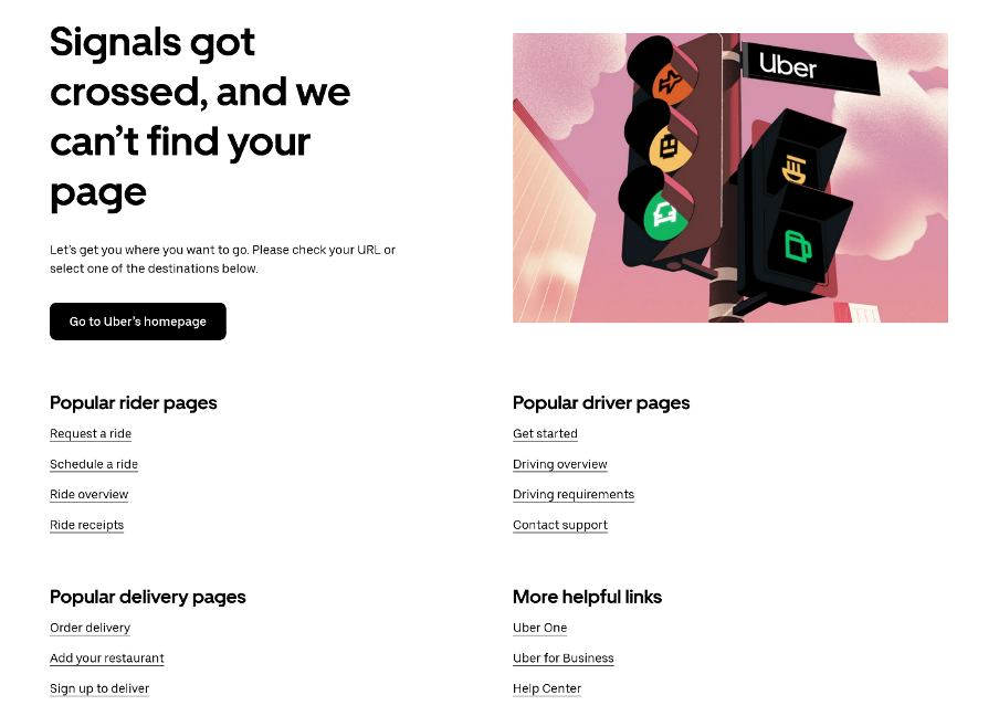
Uber’s 404 page is a good example. It includes a “Go to Uber’s homepage” button and over a dozen links to the most popular and helpful pages on the site. This ensures that visitors have plenty of options to continue their journey without feeling stranded.
Use server intelligence to suggest relevant links. Browsing history, shopping cart contents, and parsing of the failed URL can all provide pointers to related pages visitors may find useful.
However, avoid overwhelming visitors with too many choices. The error has already caused frustration, so keep things simple and clear.
Include a Search Bar
A search bar on your 404 page can be a game-changer, helping visitors quickly find what they need.
GitHub
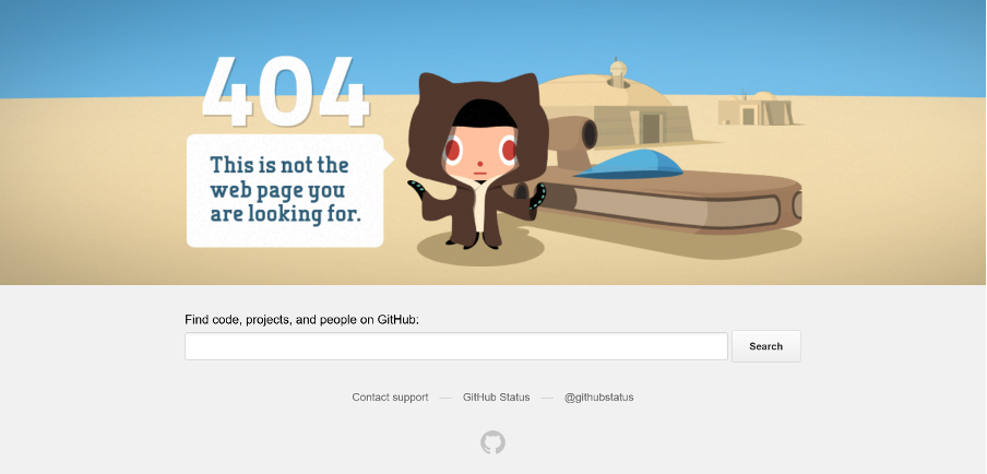
GitHub’s 404 page makes great use of a search feature labeled “Find code, projects, and people on GitHub.” This ensures users can quickly get back on track.
Engage With Your Visitors
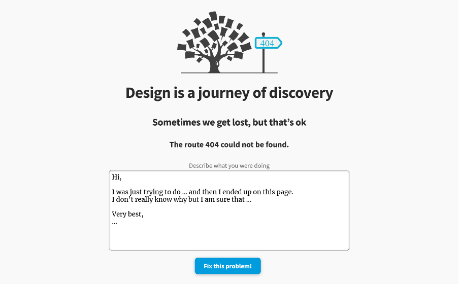
Turn a negative experience into a positive one by allowing visitors to report errors. The Interaction Design Foundation’s 404 page, for example, includes a feedback form for users to report broken links.
Consider offering discounts or incentives to visitors who report errors, encouraging engagement and repeat visits.
Add Interactive Elements
Want to go the extra mile? Some websites make their 404 pages fun with interactive elements or mini-games.
Dribbble
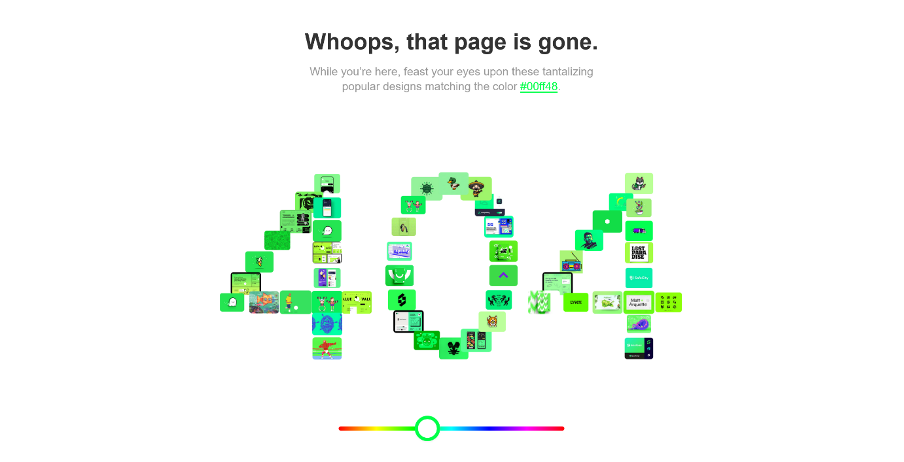
Dribbble’s 404 page lets users adjust the color scheme of the “404” text using a slider—simple yet visually fun.
Wendy’s
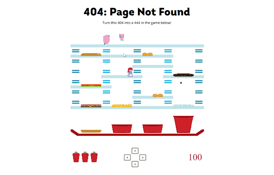
Wendy’s takes it further by turning their 404 page into a playable arcade game inspired by BurgerTime, featuring Wendy as the hero and frozen beef as the enemy. It’s a clever, brand-aligned touch.
Conclusion
A perfect website would never trigger a 404 error (bonus tip: regularly use a broken link checker to minimize 404s). But in reality, it happens, so do whatever you can to make the experience as non-disruptive as possible.
By making your 404 page useful, engaging, and on-brand, you turn a common web annoyance into an opportunity to strengthen your site’s user experience—and even have a little fun in the process!


